It almost reads like a reality TV challenge: Two Martin Patrick 3 senior interior designers, Suzanne Kickhaefer and Leigh Hull, had eight weeks to fully personalize a 1,903-square-foot condo perched atop the Four Seasons Hotel Minneapolis, in an era when supply-chain issues plague the furnishings and interiors industries and lead times typically drag on for three times that long. Could they do it?
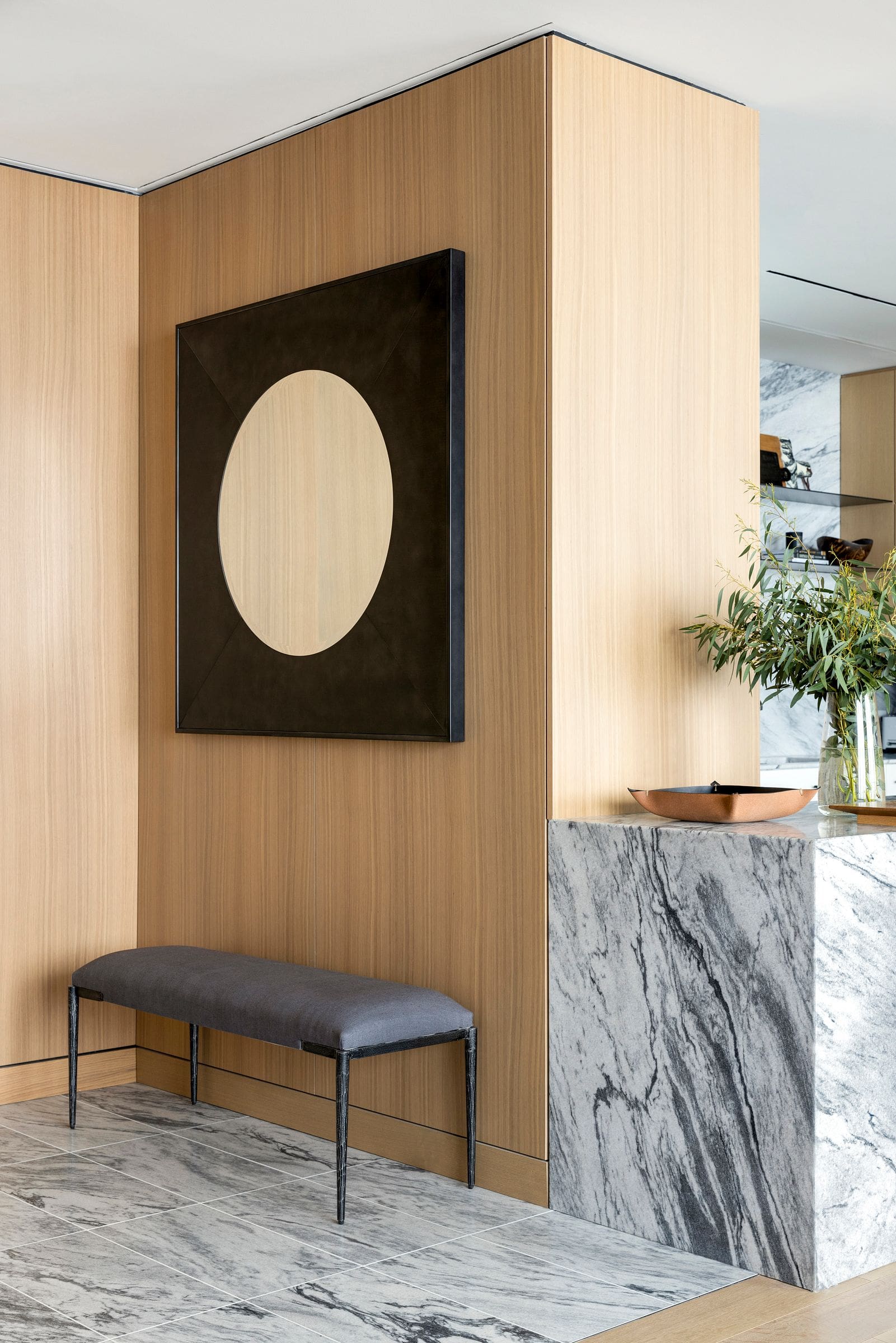
Thankfully, we can see here that this story has a happy ending. A repeat client with the acclaimed Twin Cities design firm, the homeowner had faith they could deliver. There were two finish options for the unit — one lighter, one darker — both of which were clean and modern with a mixture of oak, metals and slab materials. He opted for the lighter one. That decision, along with the spectacular views of downtown Minneapolis and the Mississippi River just out the windows, set the framework and palette for the residence.
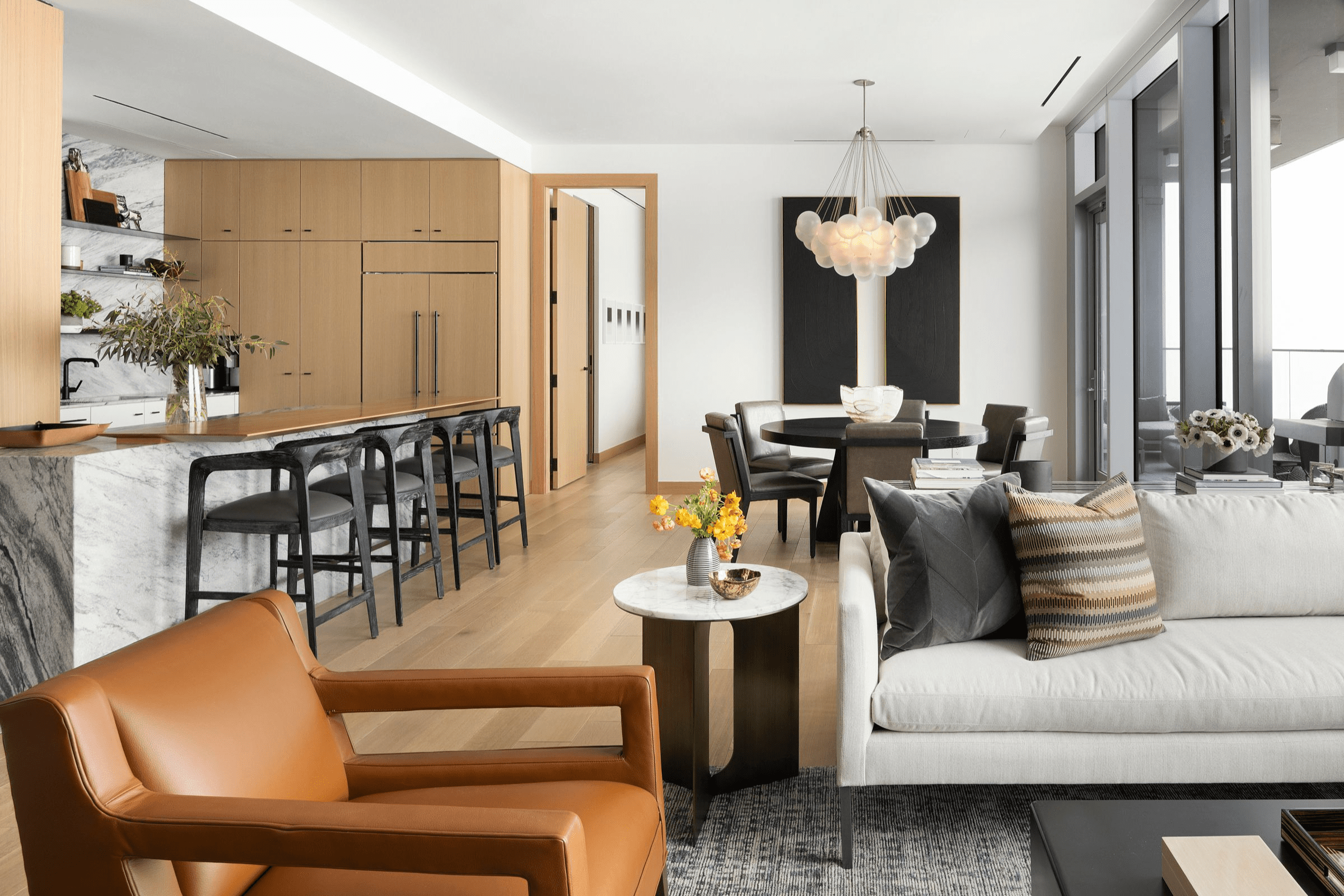
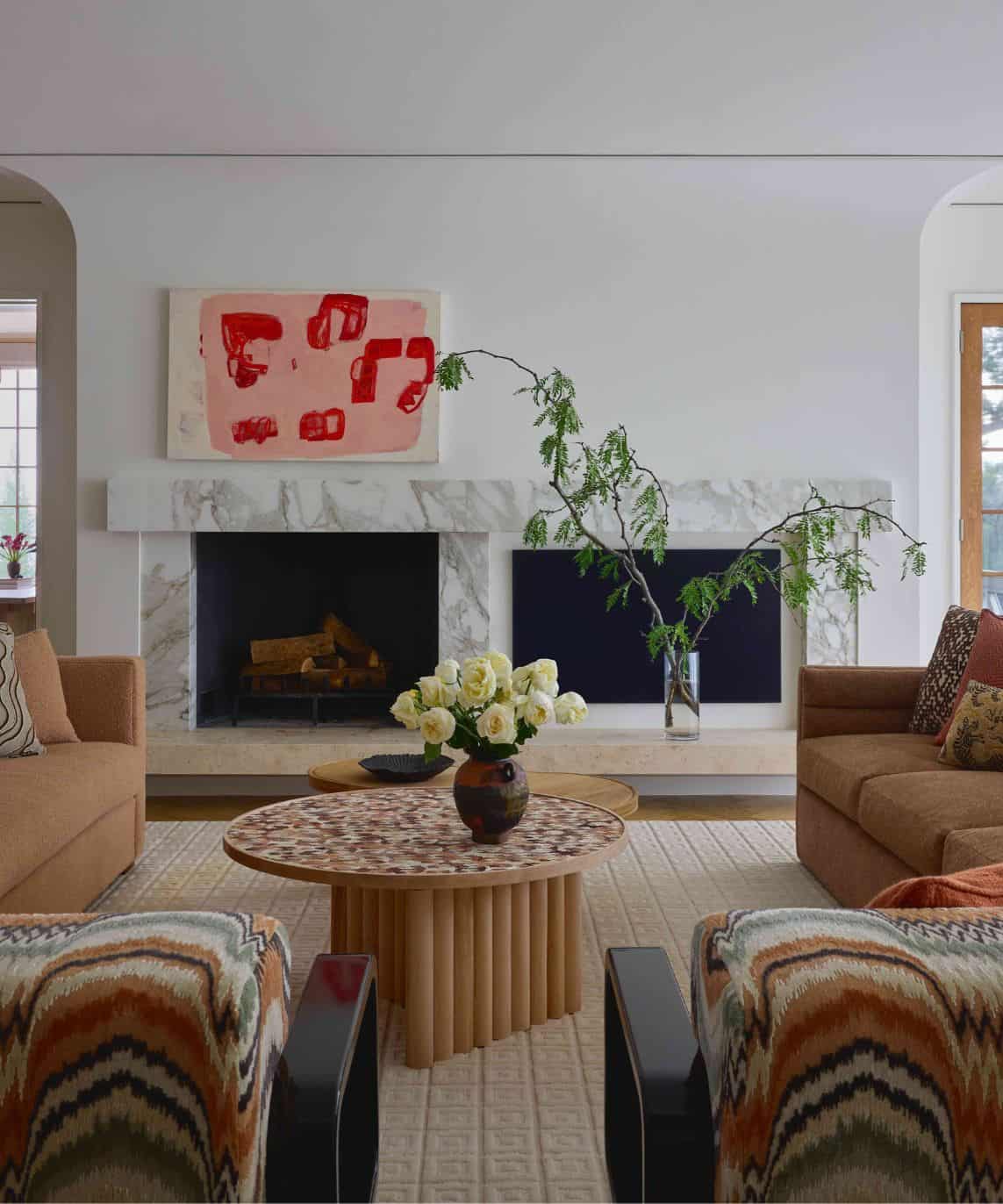
“The client wanted this home to feel masculine without being too heavy-handed,” Kickhaefer explains. “And we felt it definitely had to relate to looking out the window, since it’s all glass.” The muted yet modern color palette in the main living space acts as the perfect complement to those vistas, with really soft to dark gray blues balanced by notes of orange, ochre and camel.
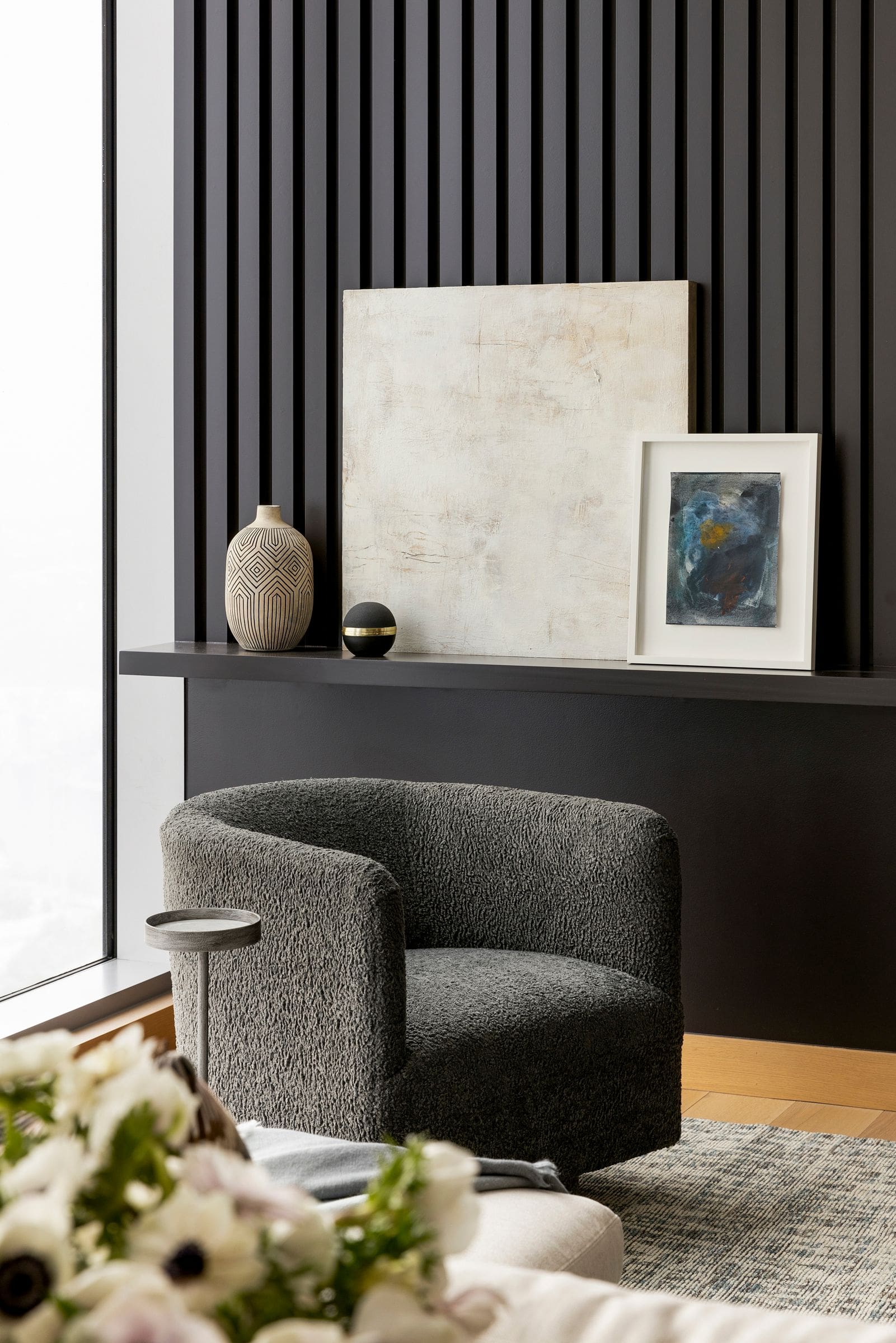
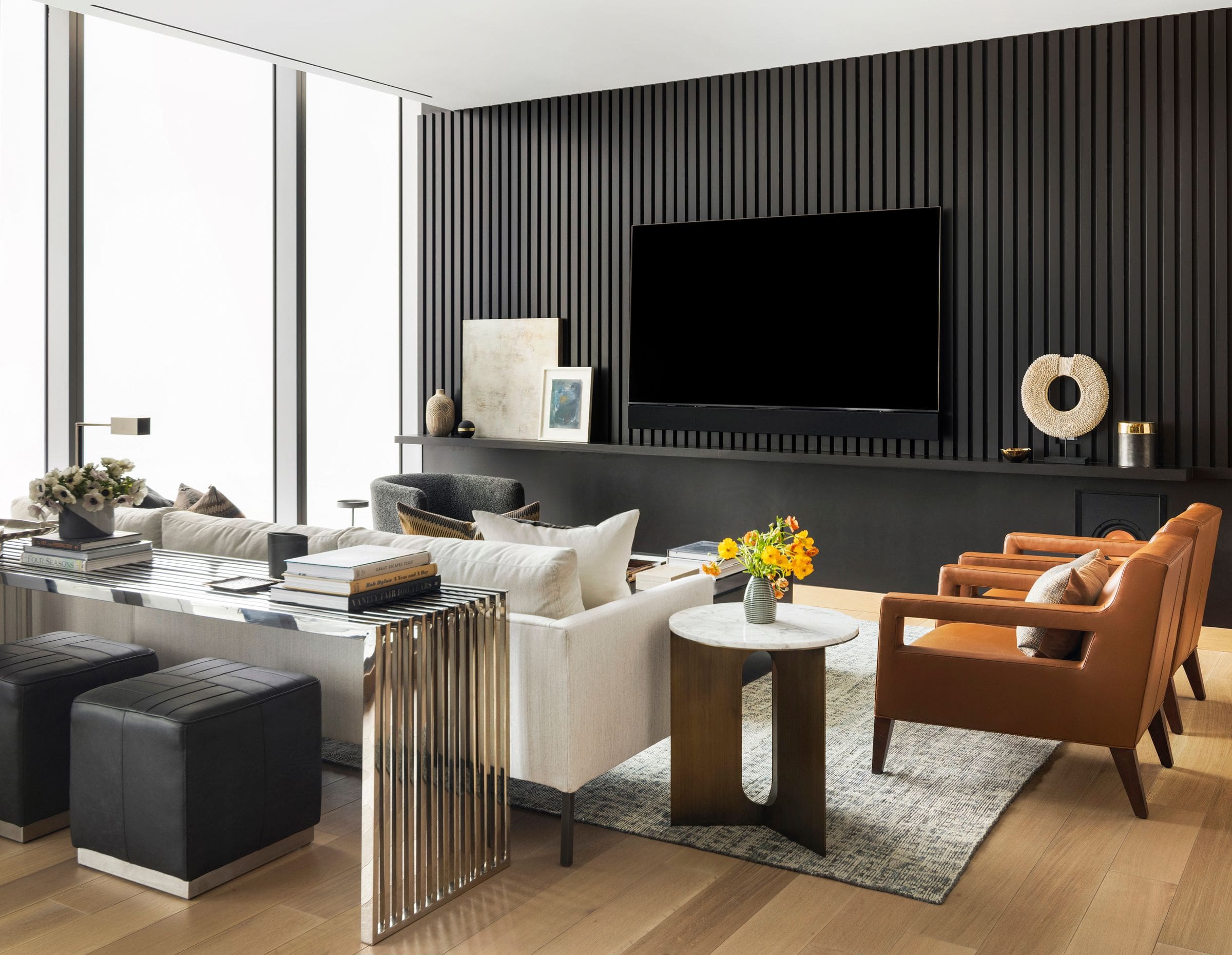
The area’s main wall was originally plain white and just begging for a feature of some sort. “We asked ourselves how we could amp up the aesthetic that’s already in place and give the space more personality,” says Kickhaefer. “Because it’s not an overly large space, every piece becomes important to balance materiality, texture and visual interest.” The statement black slatted wall does just that while still warming up the condo’s mixed metals and stone slabs. The upholstery — a charcoal boucle swivel chair, a linen-look sofa, leather chairs — also keeps the eye moving without creating clutter.
“The living room has so many layers to it,” notes Hull. “The sectional is neutral, so we added color and texture through the pillows and throw. The leather and boucle chairs, metal coffee table, and unique art and accessories create an inviting, personalized space that reflects the client.”
What helped the team stay efficient with their time and efforts was an initial meeting — the one and only meeting — where they talked with the client about his needs then created two layouts for him to choose from. Selecting some core furniture that was already available in-store was also key. “That let us see the pieces in person and even sit in them,” shares Hull. “From there, we could fill in with pieces with shorter lead times or ones that were readily available.”
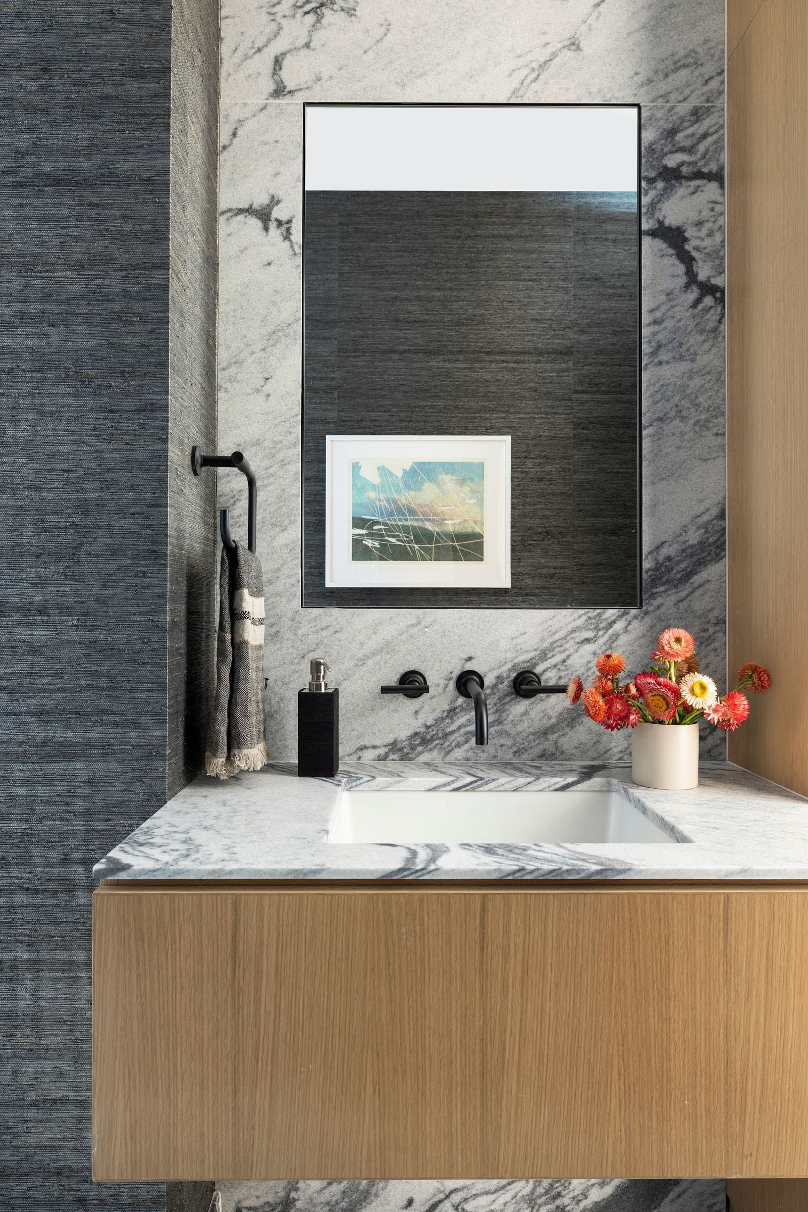
This study of contrasts continues throughout the home, including a bathroom where the designers incorporated a dark grass-cloth wall covering that adds moodiness and balances out the cooler stone, a huge chandelier that functions as much as a light source as a piece of art, and a gallery’s worth of artwork, most of it sourced from local creatives.
In the end, the happy client showed up with just his toothbrush. “We provided every towel, all the bedding — everything,” Hull concludes. “He was absolutely thrilled. He walked in, and it felt like home.”

