For Peter and Elizabeth “Gummy” Grande, moving wasn’t really an option. They had no interest in abandoning the 1939 Edina Cape Cod he grew up in, which bears sentimental value and is set above a creek (which, pre-renovation, they could barely see). The couple, who are co-owners of Fulton Beer microbrewery, craved a more modern interpretation of the home, one where they could stretch out with their two school-age kids, better entertain friends and even get a glimpse of that creek. The only catch? They didn’t want to add on, just simply reorganize within the existing walls.
“What started as a kitchen and den remodel evolved into an amazing whole-house renovation,” Elizabeth explains. “We needed our home to work smarter for our family, but making it bigger wasn’t necessarily the goal. With a few flips of the pencil, we were able to open up the whole house in a really natural way that brings the expanse of the water view inside while maintaining the charm of the original home.”
The top-notch talent behind this transformation included Vujovich Design Build and Brooke Voss Design, who paid special attention to scale and symmetry while respecting the abode’s original size and details. Together, they worked within the walls — even taking a few down — to spin the house into a more vibrant version of itself.
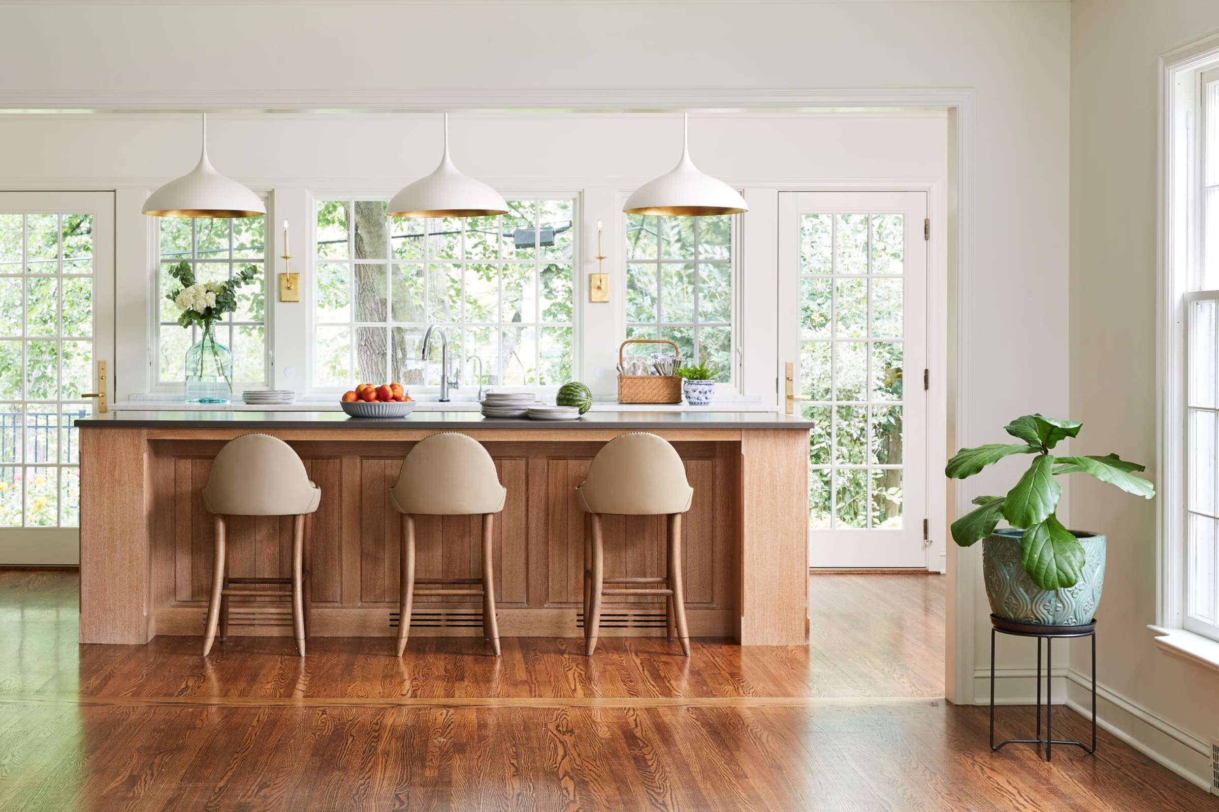
“We flip-flopped some spaces to create better flow and better connection,” notes Vujovich Client Services Director Beth Malmberg, who oversaw the project alongside Sales and Design Director Lori Balestri. To achieve this, the team rearranged much of the main floor, moving the kitchen from the west corner to the east and incorporating a large island to gather around, complete with durable Dekton countertop.
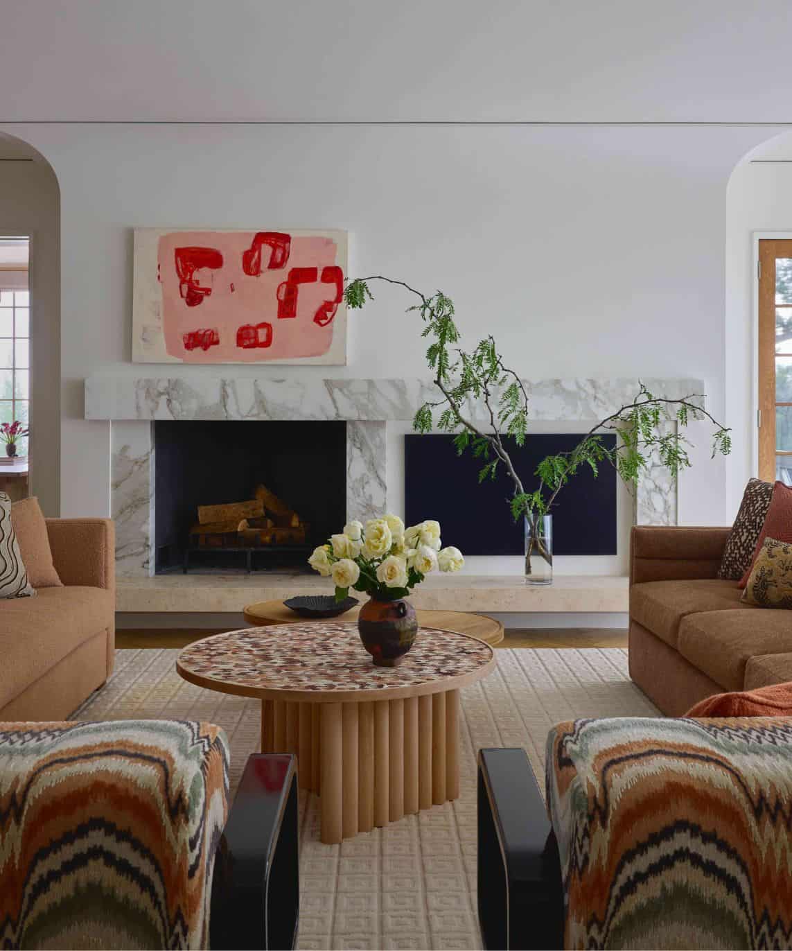
Into the former kitchen spot went a more functional family room. This shuffle also allowed for a new mudroom, powder room and pantry. Upstairs, the owners’ suite was properly outfitted with an updated bathroom, and a bright kids’ bath was incorporated into the attic. It was a puzzle where Malmberg says “aesthetic and function were equally important,” solved by creative thinking inside the box.
“Designing big and new spaces is easy — there are fewer parameters and you’re able to color outside the lines,” explains Voss. “In this project, we didn’t add square footage. We used the exact same footprint and reworked it until everything fell into a new perfect position. Proportion was key, and every measurement mattered, down to the inch.”
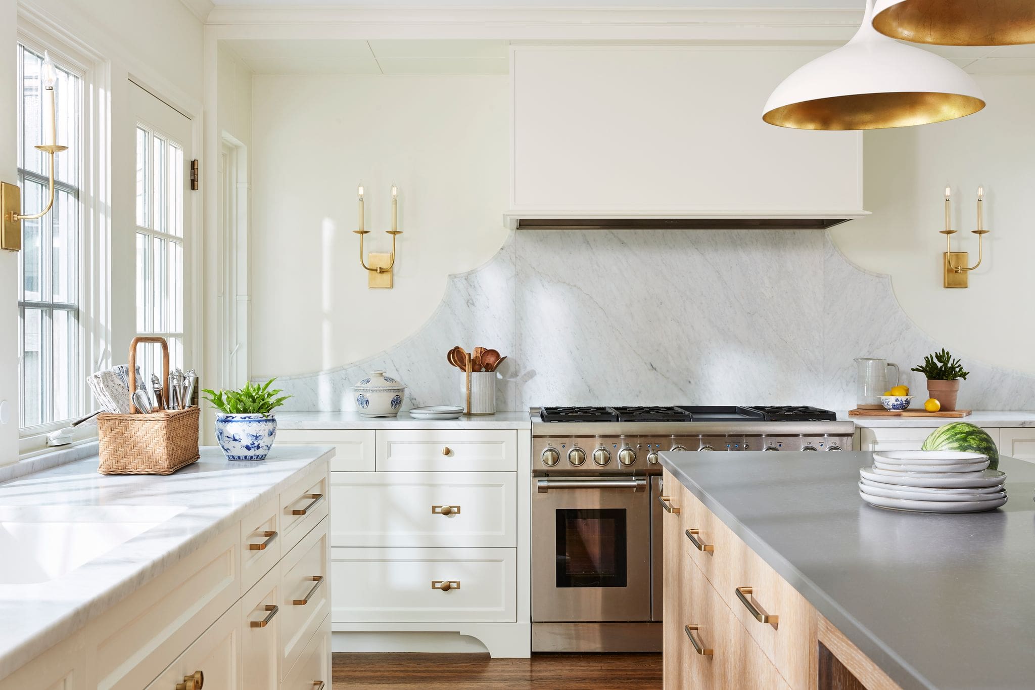
Original detail was enhanced and expanded upon at every turn. Paul Eull of Eull Woodworks wove expert artisan millwork throughout the main level, from the windowsills to the dining room’s quilt-like wall paneling to the kitchen’s cabinetry and sculptural, scalloped backsplash. Matte finishes were applied to several surfaces, including the honed marble countertops and the wood floors. And the abode was outfitted with a soft, warm palette to act as an elegant backdrop for the homeowners’ heirloom furnishings and china collection, which are accented with modern layers of tile work, wallpaper, lighting and textiles.
“When you drill down to the tiniest details, leaving no design stones unturned, you end up with a lovely, effortlessly chic project,” Voss notes. “No fillers, no frills and every little piece considered.”
And while flow and livability were at the forefront of the floor plan considerations, so too was the view. To that end, upper cabinets were forgone in the kitchen to maximize a new bank of windows. French doors in the adjacent family room continue this run of glass along the length of the house, transforming a formerly dark corridor and letting natural light and beauty spill in.
“It lives so easily, and everyone has their own space while still being able to feel like we’re together,” says Elizabeth of their newly refreshed home. “We use every inch of it and love it all.”


