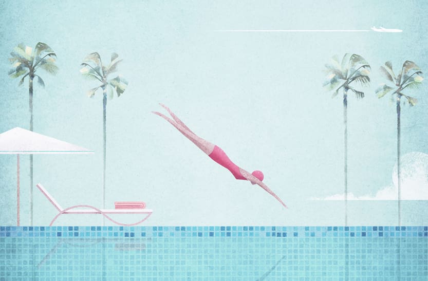
Tapped last fall to create the cover art for our winter 2019 issue, British illustrator Henry Rivers puts a modern twist on the timeless travel poster. He chatted with Artful Living about his creative process, the inspiration behind our exclusive cover art and more.
Can you describe your childhood?
I grew up on the Isle of Wight, a small island off the south coast of England. My childhood was full of animals. Living in a farmhouse in the countryside, I had a pet duck called Spike (he lived in the kitchen) and a pair of water snakes called Bob and Kate. It was an eccentric house. During the summer, my parents would host big parties in our garden where everyone had to bring a homemade hat and there were prizes for the best hats.
When did art first enter your life?
Art has been a big part of my life for as long as I can remember. I used to go along to my grandmother’s watercolor group in town. I was the youngest person there by 60 years! I also spent a lot of time drawing birds, particularly eagles.
At what point did you decide to pursue art as a profession?
It didn’t occur to me when I was younger that being an artist was an option as a career. I didn’t come across many people working in creative fields, and I was stronger at the more academic subjects, like math and science. When I was 15, a new art teacher inspired me to start thinking about art as more than just a hobby. Eventually I settled on architecture as a career path, combining my interests of math and art.
At university, I studied architecture and began to discover lots of new opportunities as to how art might be a profession. I started creating posters for drama productions and events as well as doing photography for events. By the end of my degree, I’d decided to give up on architecture and focus on art and design.
What inspires you to create travel posters?
It started off because I was very familiar with drawing buildings. In my degree, so much time is spent drawing buildings in a technical way, and I wanted to try drawing architecture and urban spaces with fewer constraints. My first travel posters were focused on illustrating the architecture of cities like London, Paris, New York City and San Francisco.
Who are some artists or figures that have inspired your work?
I love vintage advertising and posters. Art deco artists such as A. M. Cassandre really inspire me; he reduced scenes into clean geometric forms and lines, making for striking poster layouts. In terms of color palette, I’m inspired by fifties poster artists like Alain Carrier, whose designs employ dozens of subtlety different shades of two or three complementary colors.
Can you describe your creative process?
All my posters start as a scribble, usually something that takes only a couple minutes. It often takes a year or so to go from scribble to finished piece. I like to give myself lots of time to develop the idea in the back of my mind, revisiting it and re-sketching it every few weeks to tweak the layout, gradually building in more detail. The last stage is where I draw the sketches on a computer and start to add in color and texture.
What inspired the cover for our winter 2019 issue?
I looked at lots of art deco illustrations that inspired a precise geometric layout with symmetry and balance. This also gave me the idea of using a tile pattern in the swimming pool to contrast the otherwise uninterrupted, expansive blue. I love drawing palm trees, and all the shades of greens and yellows come from photographs I’ve taken of them.


