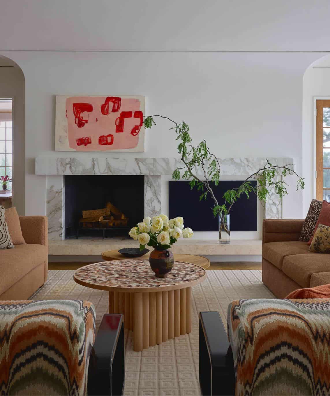
Nestled in the northwoods of Minnesota, Lilla Norr is an A-frame cabin that has been given a major refresh by Arlee Park owner Ashley and Jamie Hewitt. The sisters spent the past year updating the cabin and creating a tranquil renter’s getaway. From picking out paint colors to selecting furnishings, the duo shared with us everything it took to redesign Lilla Norr into the perfect hygge retreat.
How did the natural surroundings of Lilla Norr inspire the design both inside and out?
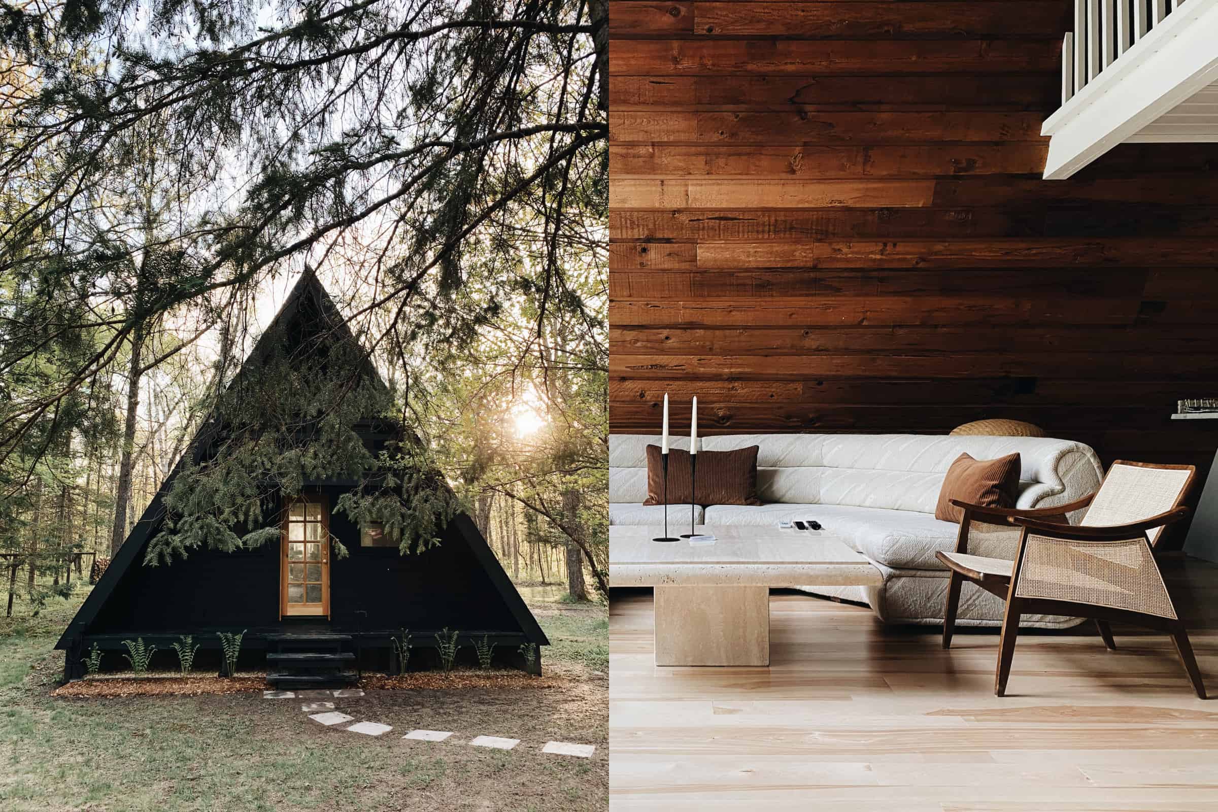
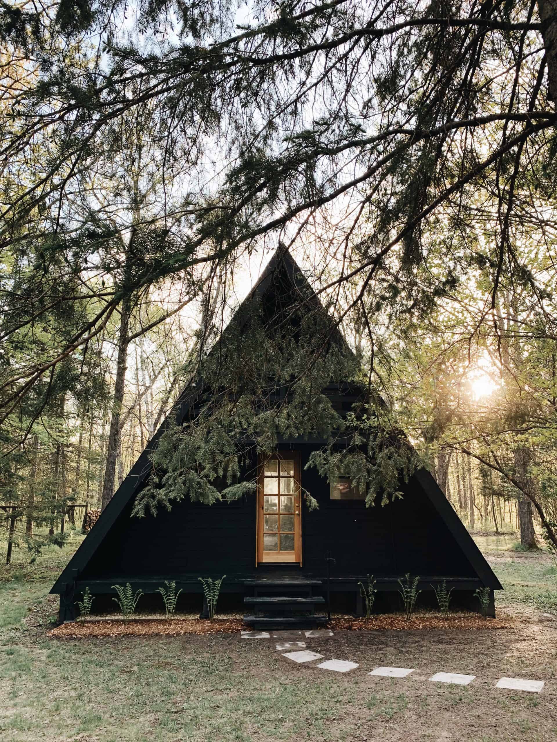
The easiest way to not compete with the surroundings was to keep a natural color palette. But we weren’t in agreement on the exterior color at first. Going black seemed stark, yet so did going white. We ultimately decided on a deep charcoal, because it blends perfectly with the outdoors. It was important for us to keep the inside equal parts bright and warm. And with the large glass windows, we wanted to make sure guests feel as though there is a continuation of scenery whether you’re inside looking out or outside looking in.
What inspired the contrast of a dark exterior and light interior?
We enjoy the play of contrast when it comes to design, and this is apparent when comparing the interior and exterior. Although the front of the cabin is a wall of glass facing west, there is only one small window on the south side. Since the property is wooded and shaded during the summer, not much natural light comes in from the south. All the different shades of dark brown inside really absorbed all of the natural light, and we knew it was important to lighten up the inside by not only adding better light fixtures, but to paint the wood tongue-and-groove walls. The one thing we instantly agreed upon was to not touch the original sawn cedar paneling on the slanting walls.
How did you design the interior space with the cabin’s existing architectural elements in mind?
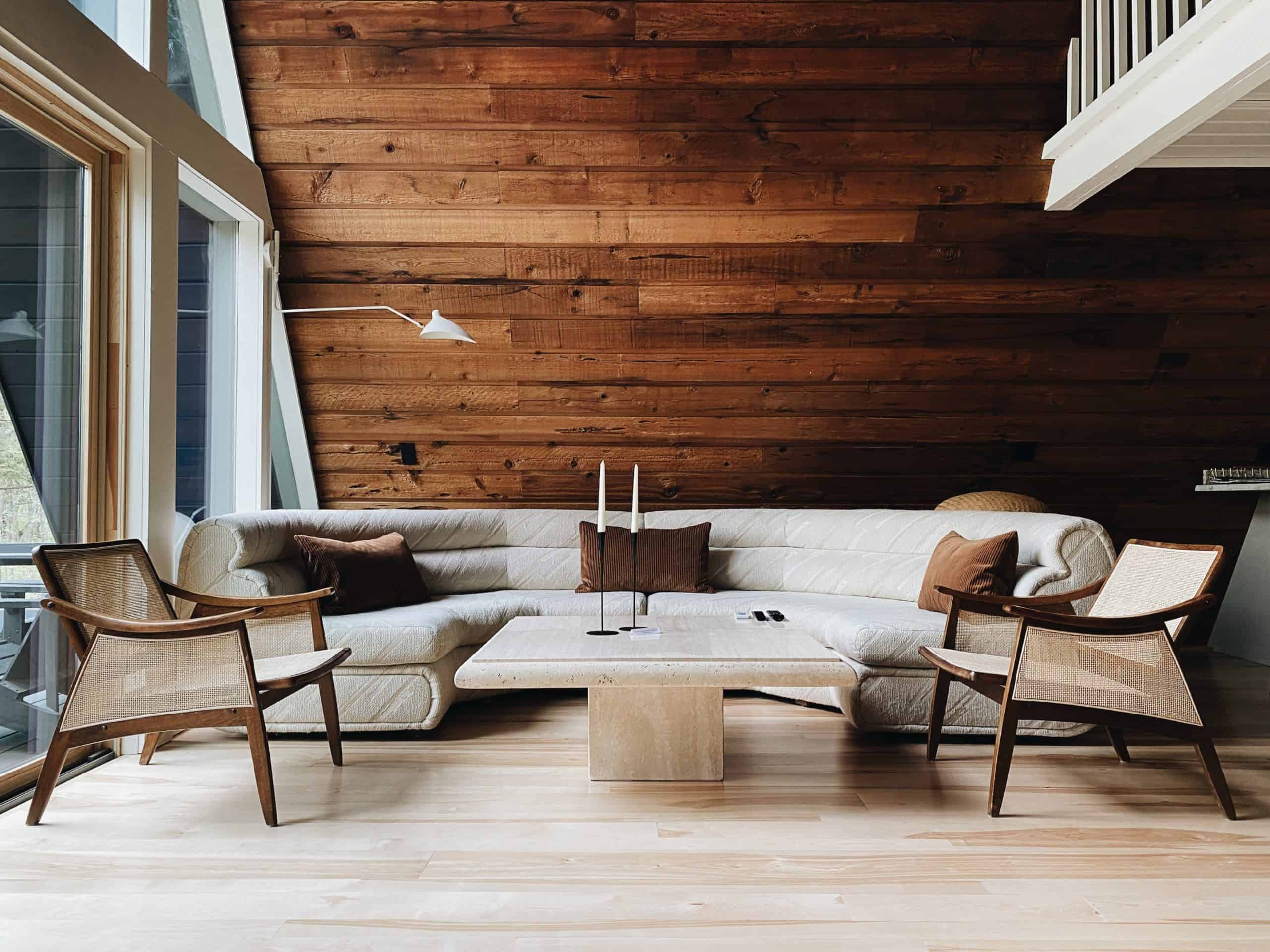
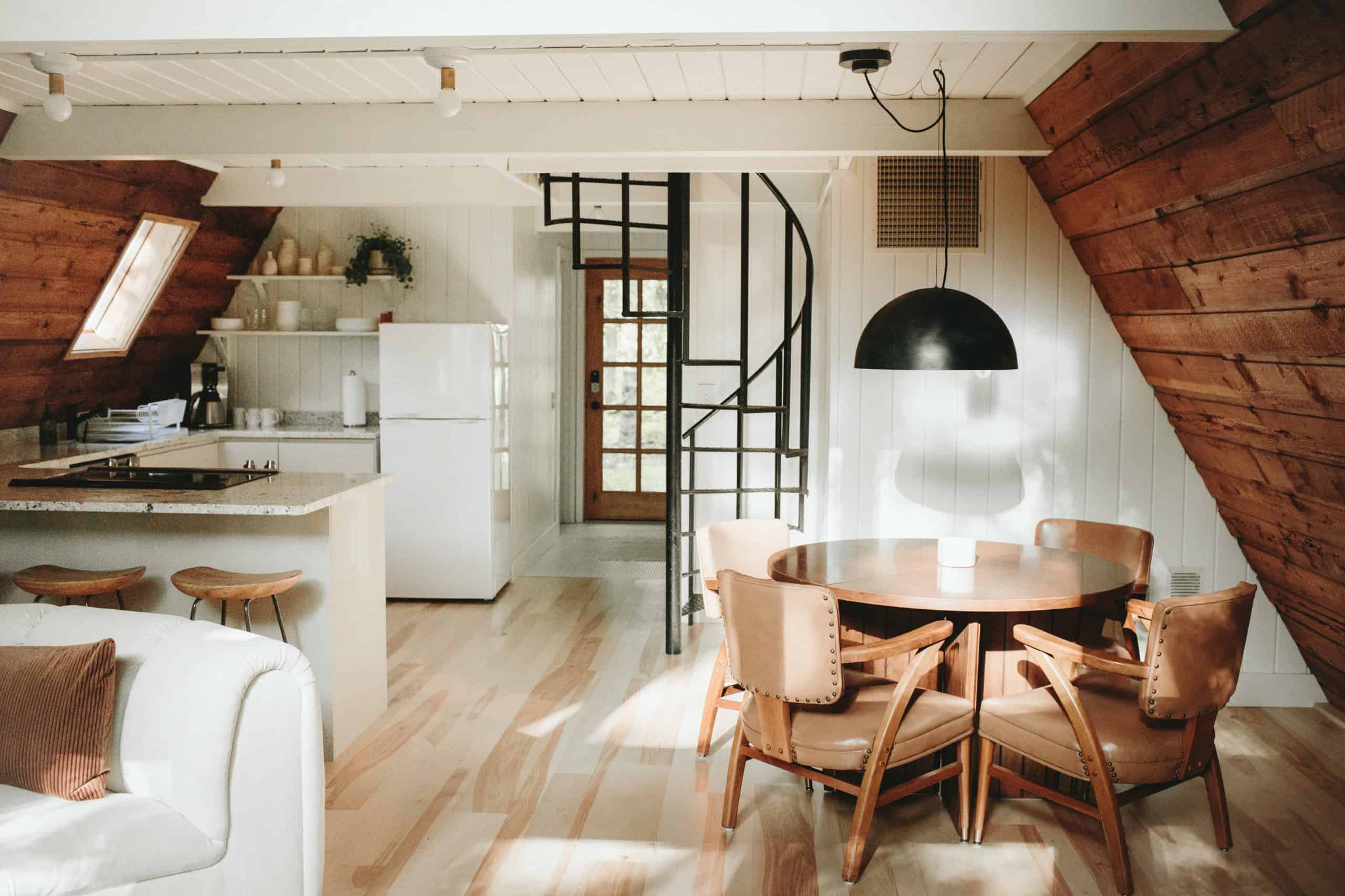
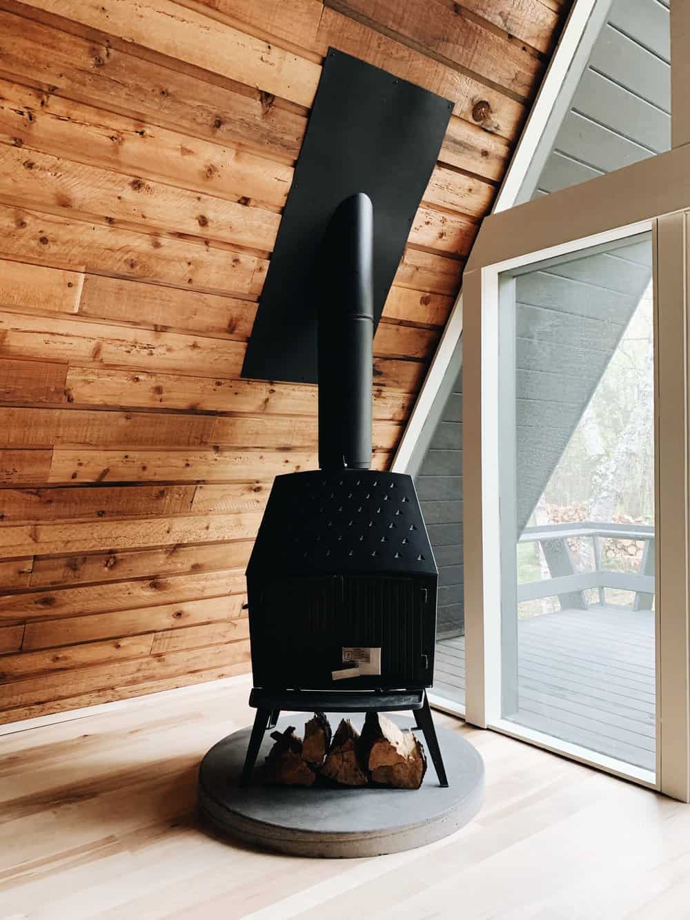
Shapes really shine in this cabin. The A-frame itself really steered us in a direction as we started collecting furnishings. The combination of soft circular shapes — including the round Lane dining table, curved vintage couch, self-poured circle concrete hearth and rounded corner half-moon bathroom sink — sharply contrast the straight and sharp angles of the stone coffee table, midcentury dressers and A-frame shape itself.
Were there any major pivots throughout the renovation process? Is there anything you wish you could have done differently?
Digging into a renovation on a 1978 structure will always reveal unexpected projects. Going into the restoration process, we knew there were items that were going to remain the same and items that we wouldn’t be able to salvage. We were able to clean up the cedar shiplap on the slanting A-frame walls. The main floor had three different types of flooring, one being carpet that had to go. After demoing out the tile and laminate hardwood floors, we discovered rot of the subflooring in the bathroom that existed all the way to the floor joists.
The other large project that we’ve broken into stages is the glass wall of windows. When we first looked at the property, we wrote off the existing fog as a layer of dirt and assumed the windows just needed a good cleaning since the property wasn’t recently used. It turned out that the gas seals cracked and decayed, which caused fogging of the glass. After the birch flooring, the glass was the second costliest item, so it made sense to do what we could afford with our budget before renting the space out.
How did you balance the vintage and modern vibes when furnishing the cabin?
The decision was based mostly on the vintage we could source at the time while also considering what made sense to buy new. Given that this is a rental, we knew the furniture would show quick signs of wear, so not-so-perfect vintage pieces were our first choice. Because our Arlee Park inventory is cohesive with the design direction we were taking with the cabin, we pulled our dining table and chairs from the shop. The couch was the one item we knew exactly what we were looking for but had to wait patiently to find. It took a few months of scouring the Internet daily, but the Bernhardt modular sectional we ultimately found deserves all the credit for pulling the space together.
Other pieces include a vintage travertine coffee table and TV console, Morsø wood stove, vintage bathroom sink, Danish petite dressers from our friends at Golden Age, and some pieces from our favorite vintage store in Minneapolis, Southside Vintage.
Hygge is all about finding joy and comfort in life’s simplest pleasures. How did you implement this energy throughout Lilla Norr?
Although we live in Minneapolis, we come from a rural upbringing surrounded by acres of nature. At Arlee Park, we’ve always focused on the design and curation of goods rather than being a quintessential cluttered vintage store. Our customers appreciate the cohesion throughout the store, which has elevated the brand. When we had our brick-and-mortar, our customers would say they wished they could stay and hang out all day because the store brought them a sense of calm and relaxation.
When Lilla Norr came about, we knew it would be an extension of the store in the sense that it would focus on design and echo the minimalism and comfort of our store. Once our guests arrive, we hope they make themselves comfortable and are able to decompress. By minimizing decor and trinkets in the space, we let guests unfurl their own belongings and feel right at home.

