The word “curated” gets thrown around a lot these days, but what does curation actually look like in practice? In interior designer Heather Peterson’s case, the word is a fitting way to describe the two-year process of planning, sourcing and styling a more-is-more vacation home in California’s wooded Soda Springs.
Before founding her Minneapolis-based design studio in 2011, Peterson worked in advertising, served as a photo editor at Real Simple and earned a master’s degree in curatorial studies before spending six years in public art. After honing her eye for design and art in all its forms, she returned home to Minnesota to launch her own interior design firm. “In my previous careers, I was in support of the creative,” she says. “Now, I get to be the creative.”
Photography by Josh Grubbs
That multidimensional artistic background is evident in Peterson’s work, where rich color, pattern-maxxing and vintage furnishings converge. It’s also what drew one longtime client back to the designer when her family purchased a ski home in the mountains of Northern California.
Peterson had already worked with the family on their primary residence in Piedmont, California, after another client recommended her to them. The two proved to be highly compatible collaborators. The client frequented flea markets, collected pieces while traveling and occasionally picked up roadside finds but wanted Peterson’s help pulling it all together. When it came time to decorate the family’s mountain house, however, she had one directive: If they had used a color or pattern in Piedmont, she didn’t want to see it in Soda Springs.
“A vacation home is an opportunity to do something different from your primary residence, to explore another side of your personal aesthetic, push the mix, take more risks and have more fun,” says Peterson. “Presumably, you go to a vacation home to get away from regular life. So you can build an environment that supports that. In this case, we wanted something immersive, magical and woodland.”
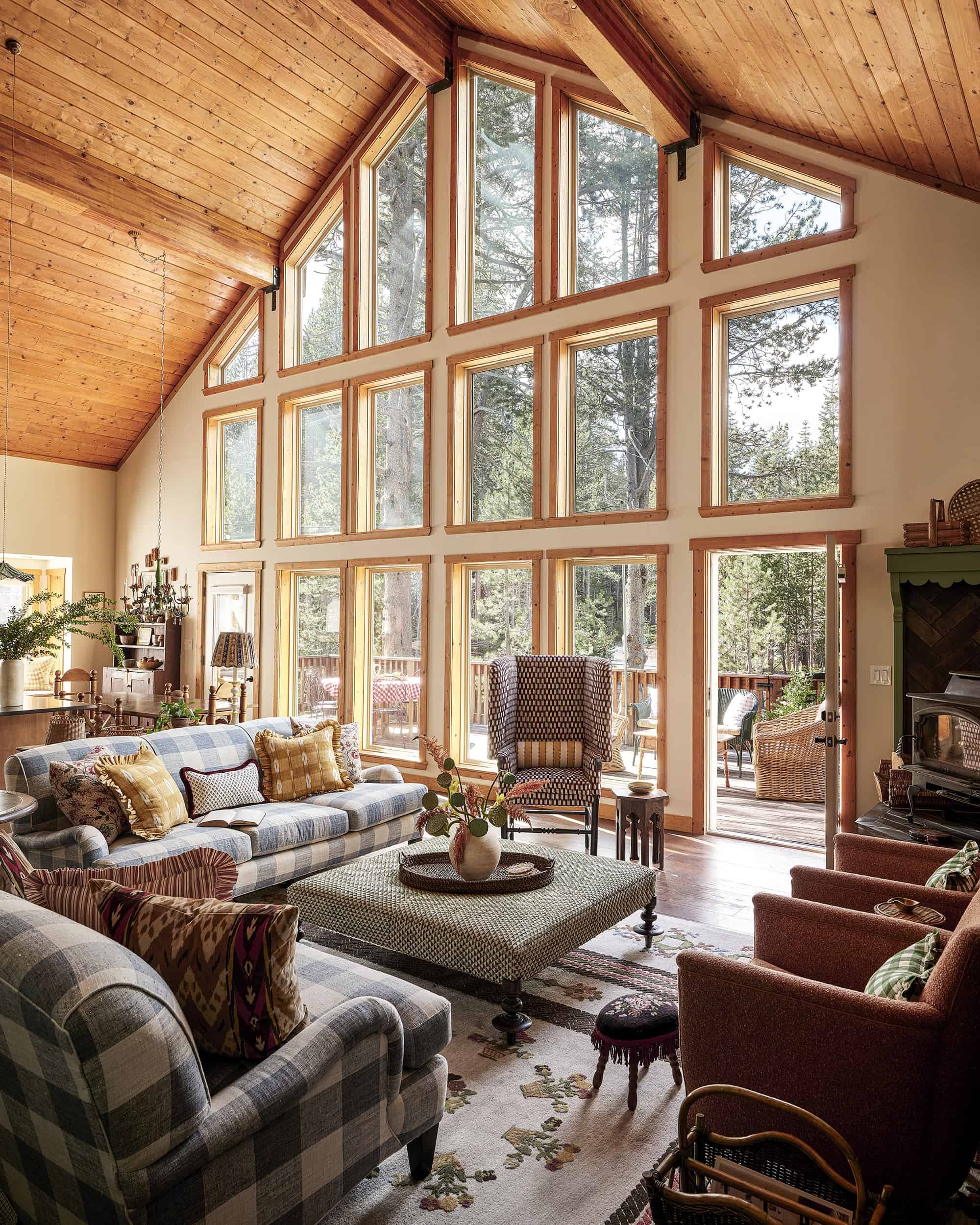
The house had all the hallmarks of classic Tahoe architecture, including a soaring wall of windows, lofted spaces and pine V-groove ceilings. Outside, towering trees surround the property, giving it a shaded, woodsy character even in summer. In winter, snow can accumulate as high as the home’s second-level windows.
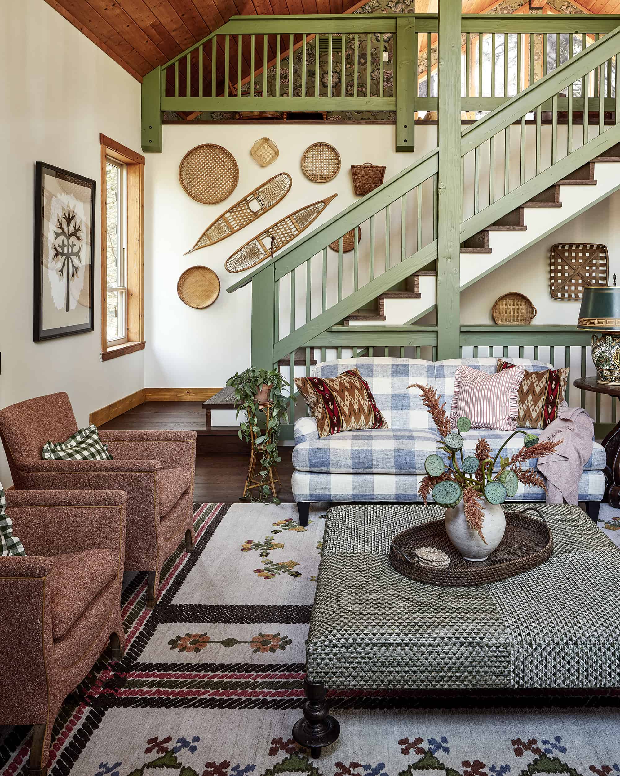
Peterson found plenty of inspiration in the home’s character, but she made some much-needed updates as well. Engineered oak flooring replaced faux-wood vinyl and dated carpeting, creating a neutral base among the home’s existing mix of pine tones. The freshly redone floors got covered by luxurious rugs with Eastern European folk-inspired patterns. The stair railings and posts were painted a springy Farrow & Ball Calke Green, a move that complemented the varied wood finishes while bringing the forest palette indoors.
As for decor and furnishings, the design team used the full rainbow spectrum, grounded by wood as a textured neutral. Vintage baskets and snowshoes decorate the interconnected kitchen and living room walls, suspended above furniture upholstered in baby blue gingham and adorned with patterned yellow and red throw pillows.
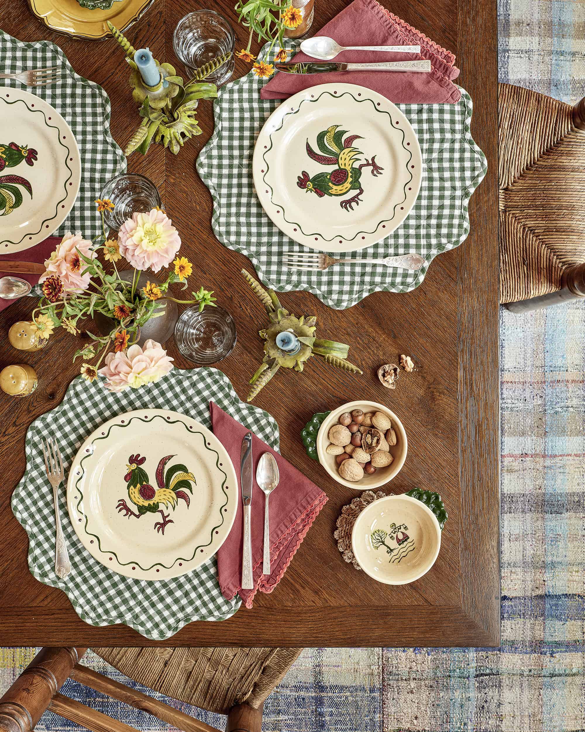
“I love how maximalist the home is,” says Peterson. “We’re known for mixing a lot together but usually with a bit more visual breathing room. Getting to max it out with the collection of baskets, gallery walls and all the layers was really fun.” That sense of abundance carries throughout the house, but each area has its own identity. She calls the approach a “full environment,” one in which every room becomes its own mini world, usually inspired by a singular piece or pattern that enamors the designer or client.
In the bedrooms, wallpaper came first. House of Hackney patterns created an aesthetic thread throughout, without becoming overtly repetitive. Across the house, dense fall florals, prancing animals and tapestry-like geometrics wrap the rooms. In the primary bedroom, the ornate mauve wallpaper contrasts with the more traditional striped bed, green printed bedding and Sarah Blomfield handpainted lampshades. “There are no throwaway decisions in those bedrooms,” says Peterson. “Every item contributes to the mood.”

The same philosophy guided the art. Because the family was furnishing a second home, there were plenty of blank walls to fill. Peterson sourced mainly vintage works, identifying early on where individual pieces belonged and where a collection would have more impact. When the team found a particularly striking red floral painting, it inspired a yearlong scavenger hunt to fill a hallway wall with similar pieces. As they traveled, Peterson and her team kept an eye out for other red floral paintings, while her client contributed finds of her own. Eventually, the individual paintings became a gallery wall united by color and subject matter.
That willingness to wait for the right piece is central to Peterson’s process. During any given project, she and the team shop vintage, locally and on buying trips to Chicago, Milwaukee or High Point, North Carolina, leaving wiggle room in the design for discoveries rather than specifying every object at the outset. The clients were enthusiastic participants. For instance, on a trip to Paris, the husband spotted a vintage foosball table at a flea market. It now sits in the lower level of the ski house. That find helped establish a quirkier direction for this gathering space. Drenched in Farrow & Ball’s deep Preference Red, the space features the game setup alongside scenic art, diversely patterned upholstery and playful pieces like a rooster-shaped lamp.
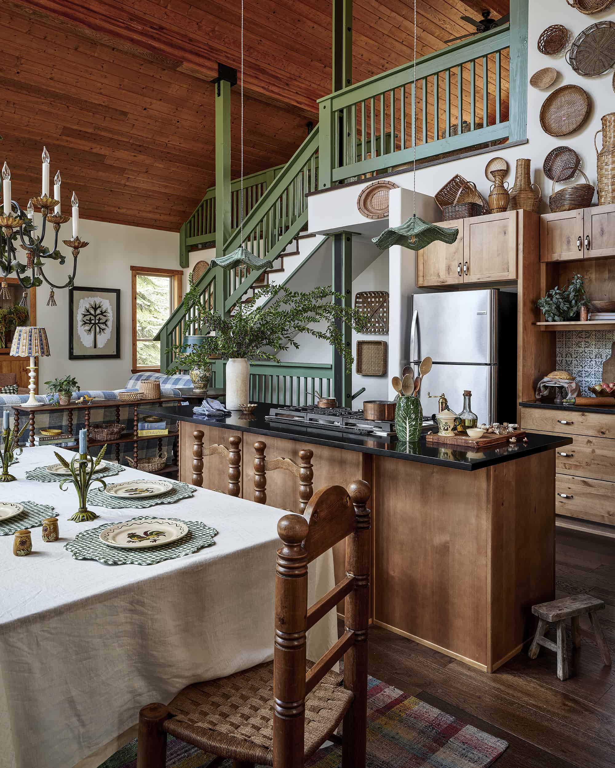
The project also evolved as the family lived in the house. In contrast to most of the homes she works on, Peterson initially completed the interiors before returning for a second phase of light renovation. The kitchen received new hardware, tile backsplash and window treatments.
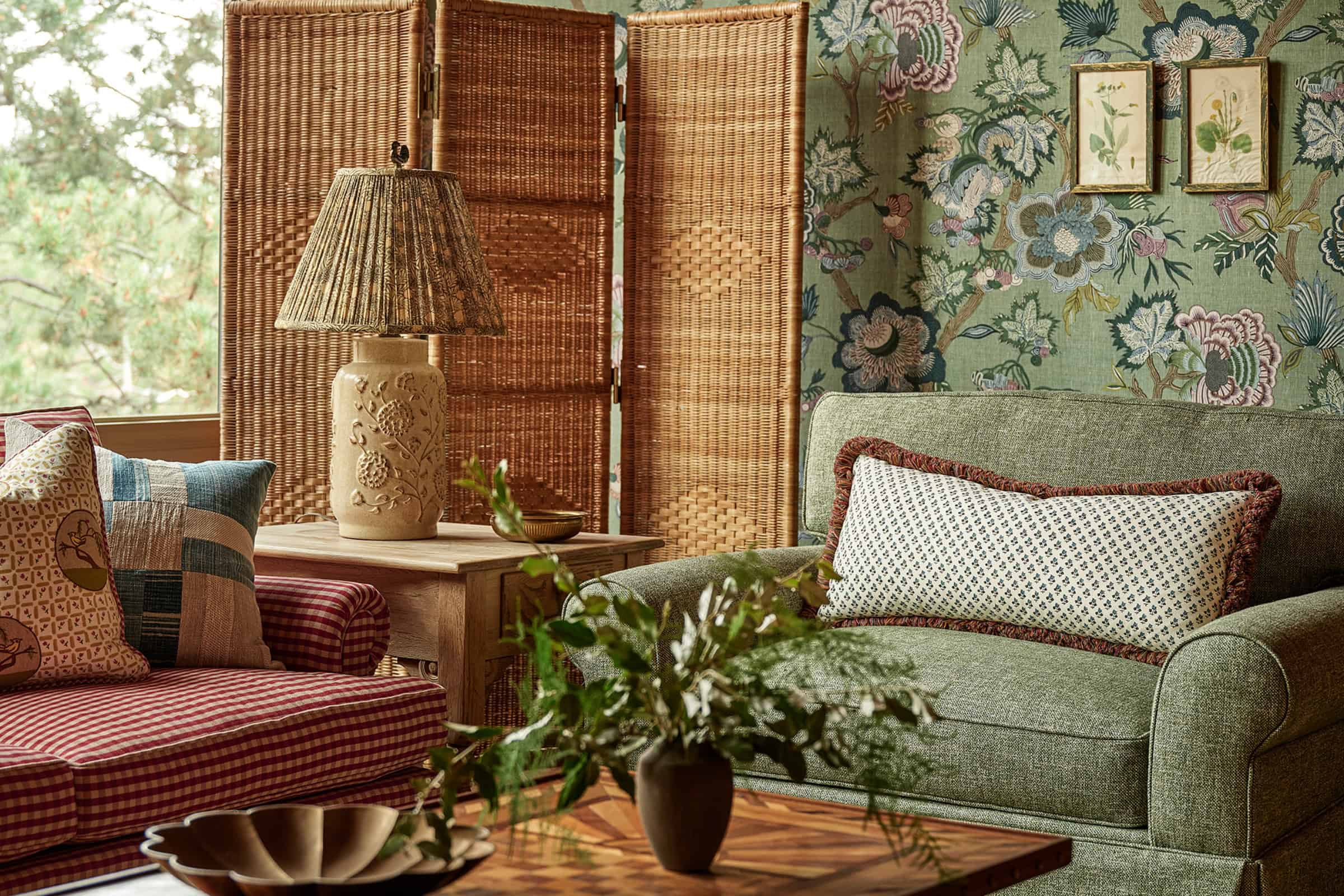
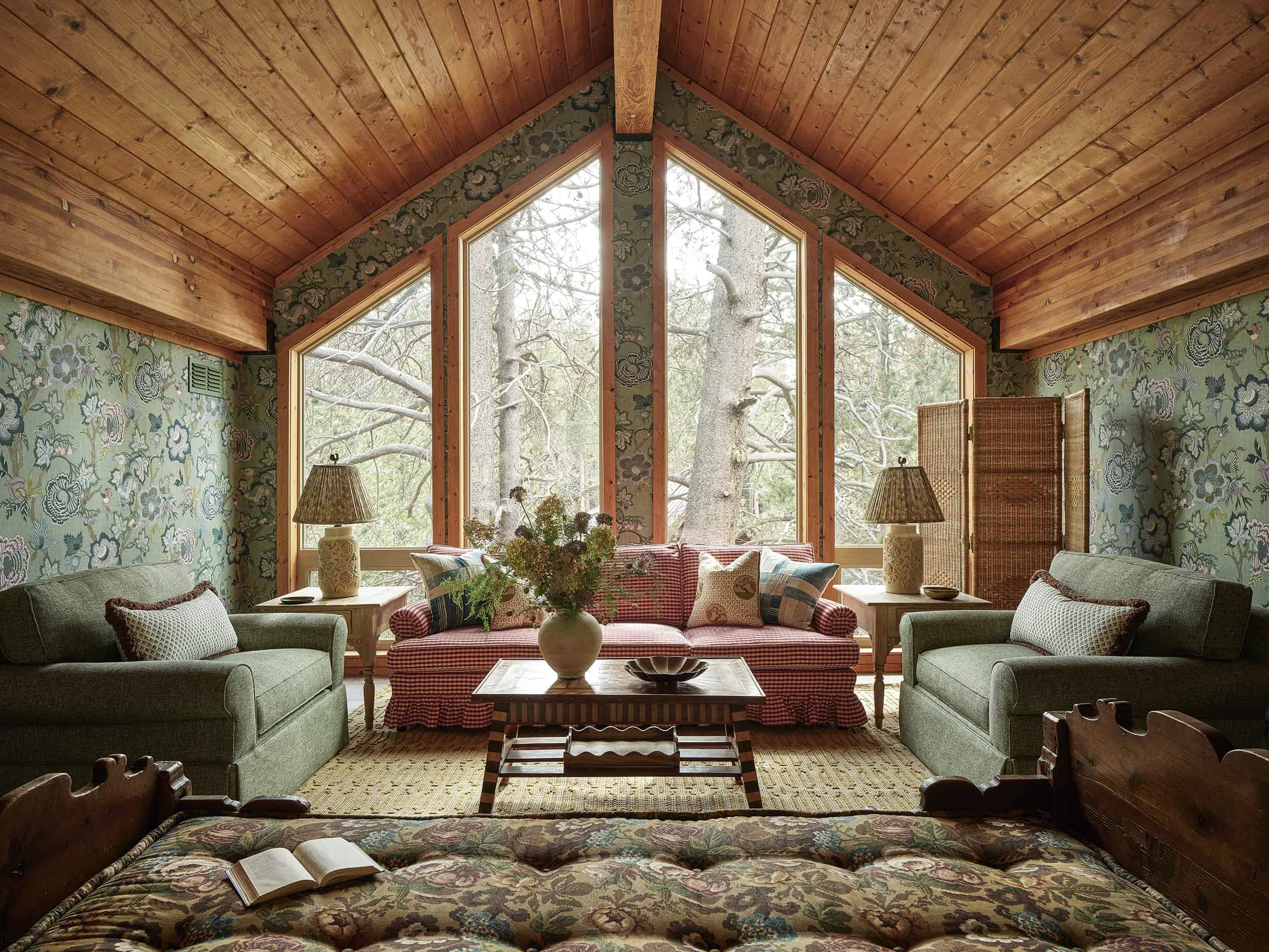
Upstairs, the loft was reconfigured to carve out an additional bonus room with custom built-ins, a daybed and double doors. In the main lofted area, a Thibaut fabric wallcovering shrouds the space in green florals beneath the original pine ceiling. A sofa carried over from the family’s former San Francisco home was transformed from cream linen into red Pindler gingham and is joined by Lee Industries chairs, vintage tables and an Italian daybed. The surrounding treetops — on full display through the expansive windows — become part of the lush green palette. “The loft was one of the last spaces to come together, but it’s my favorite environment,” says Peterson. “It feels like you’re up in the trees.”
Ultimately, the Soda Springs ski house’s artful curation was a practice in communication and patience, backed by the rigor required to execute a multi-year project across several states. Working across both their primary and vacation homes, Peterson and her clients developed the kind of trust that creates space to make bold decisions and have fun with design — all while maintaining a clear vision across hundreds of individual choices. The final result reflects both sides of that process: disciplined curation and the confidence to enjoy it.
Project Partners
Interior designer: Heather Peterson Design
Builder: Highmark Builders