The vibrant palette of Los Angeles–based artist Andy Dixon’s paintings is the first thing that will catch your eye. But it’s his combination of classical art imagery with a style that is simultaneously elegant and whimsical that really sets his work apart. Starting out as a musician in Vancouver’s punk rock scene, Dixon spent time as a graphic designer in the music industry before diving head first into fine art. Today, he exhibits work around the world from New York City to Hong Kong, and has landed collaborations with luxury brands like Versace. Here, we sit down with the artist behind our summer home issue cover and talk inspiration, artful home design and his love/hate relationship with luxury.
How would you describe your painting style?
I’ve been at this for a long time and I still don’t have my elevator pitch down. I usually just start rambling off keywords: pop, California, the eighties, Hockney, old Looney Tunes cartoons.
What are your biggest sources of inspiration?
I think most artists including myself are constantly cataloging all stimuli into “I like this” and “I don’t like this.” So, in a way, everything is inspiring — the color of a flower set against the color of the grass, a song, a story told by a friend.
You have a unique background as a punk-rocker-turned-artist. Does your experience in music inform your work today?
Yes, I started music when I was very young, playing my first show when I was 12, but, alongside making music I was also always interested in visual art. I’d end up drawing things for our album covers, T-shirts, posters and eventually I guess I realized that it was more my calling than the music-making. I definitely still carry a certain DIY punk ethos with me today.
Can you take us inside your creative process?
Lately I’ve been making digital collages in Photoshop, plundering the internet for historical art imagery to clip out and rearrange. In this way, I’m doing something that’s still similar to what I was doing in music when I entered my experimental electronic phase — sampling. Once I have a composition I like, I translate it onto canvas with paint and oil stick, making color choices in real time.
As the artist behind the cover of our summer home issue, what draws you to painting interiors?
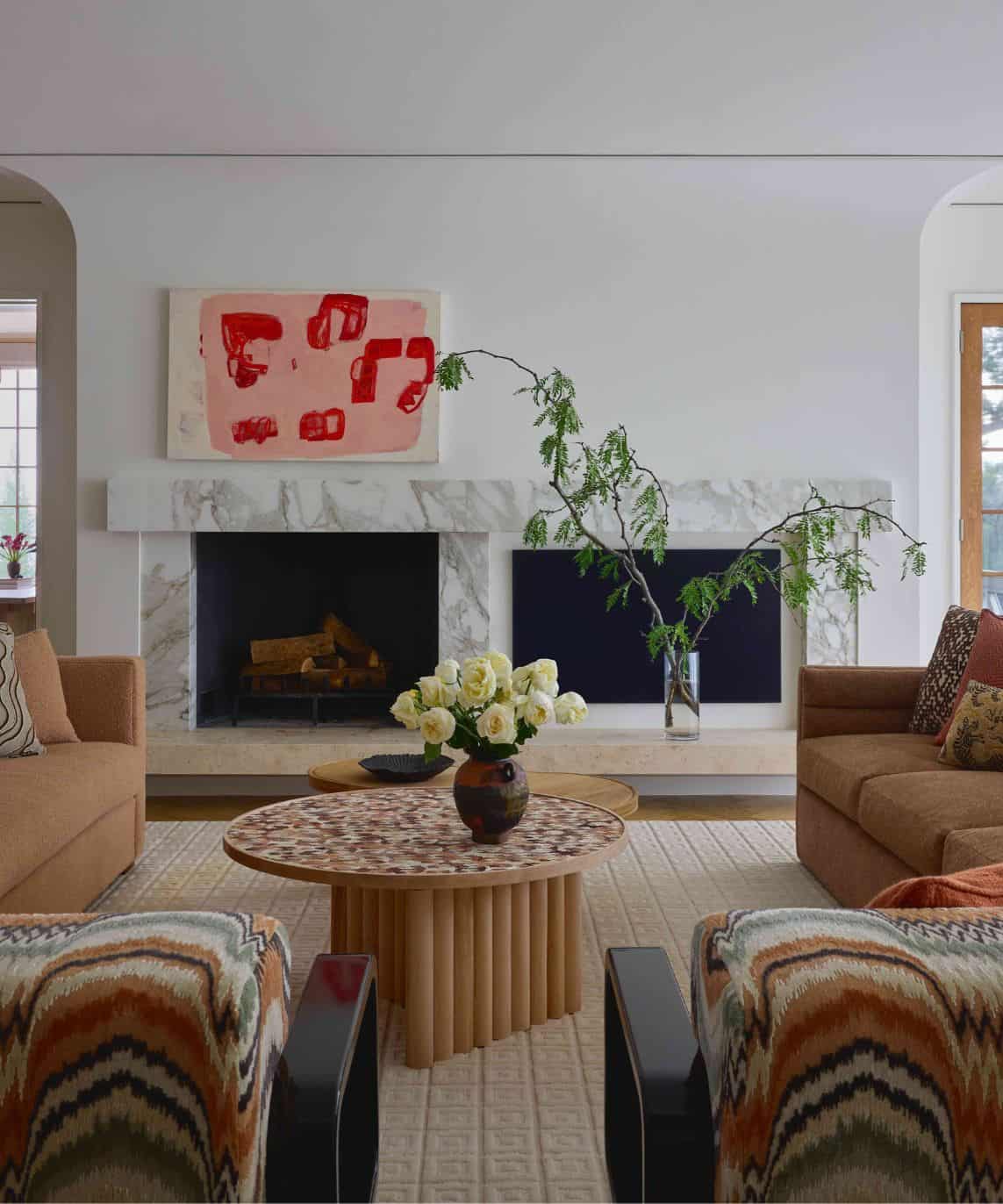
I like the rich history of interior painting, but my twist on it is that my works always concern themselves with patronage. I have a series called Patrons’ Homes where I paint my paintings in collectors’ new homes once they’ve been acquired. The piece on the cover of your summer issue is actually of an auction house showroom. I love the idea that it’s completely staged with everything in it positioned for maximum sellability. It’s beautiful and also kind of fake at the same time, which is interesting to me.
Your own abode was recently featured by Architectural Digest. How do you translate your creativity into home design?
My color palette definitely comes through in our home. I think, again, it’s like the answer I gave about inspiration: I don’t think creative people can help it, really. I see things I like and I see things I don’t — form, light, color. It’s natural for me to bring that into our home.
Luxury is a big theme in your work, can you tell us more about this?
I think approaching the art world from this sort of outsider punk kid viewpoint, I had to reconcile with the fact that, as an artist, I’m essentially making luxury objects. Growing up in a social sphere where “selling out” was the ultimate sin, I had to come to terms with this and decided, fuck it. I’ll just lean all the way in and make fun of myself.
What does luxury mean to you?
I’ve been asked this before and don’t really know how to answer because I have such a love/hate relationship with luxury. On one hand, I’m a person obsessed with comfort. I’d rather die than go camping, for example, but on the other hand there’s still that punk kid in me that wants to eat the rich.
You’re on a desert island. You can take five luxuries with you, what are you bringing?
A comfy bed with nice crispy sheets. An unlimited supply of coffee. An unlimited supply of wine. Paint. And, of course, some good company — my wife, my dog and a few of my more interesting friends.
What was it like to collaborate with Versace?
Working with Versace was a complete dream. I don’t think there could be a more perfect pairing since I think Versace has the same ironic or tongue-in-cheek lens on the world of luxury. I am currently working on something really fun with the eyewear brand, Jacque Marie Mage that I’m buzzed about!
Can you tell us about your current work, Don’t Sweat the Big Stuff?
Yes! That’s a newer piece made with the process I described earlier — a kind of “sampling” of art historical images composed into a new form and translated into my color palette. I’m elated about this direction and excited to make more.
What’s next for Andy Dixon?
I’m gonna watch some reality dating shows and drink some water.


